| Home | FAQs | Book Contents | Updates & News | Downloads |

Those who have tolerated at any of my recent presentations will be aware of the fact that I am enthusiastic about pictures, animation and simple analogies (indeed many have suggested that this obsession is one of my character flaws). More than one person has suggested that time I have devoted to creating and honing diagrams that are to be presented for just a few seconds cannot possibly be justified. Of course, I don't have any choice in this, my need to zealously perfect any graphical depiction is a personal compulsion, it is an instinctual part of my make-up (and, indeed this particular shortcoming has been passed on to the next generation).
Even if I wasn't personally haunted by a serious perfectionist streak when it comes to pictures I believe that the time invested in creating graphics can be justified. Really quite complex concepts can be quickly conveyed through a carefully crafted image, a good picture is a powerful weapon in our armoury of persuasion. It is always worth ensuring that any content does not irk the viewer: choosing colours that complement the concepts and each other; picking fonts that reinforce the ideas without clashing; opting for a scenic perspective; picking element sizes that match the ideas and the underlying data; using language that is familiar but precise. All these help ensure the viewer will focus on content not facade.
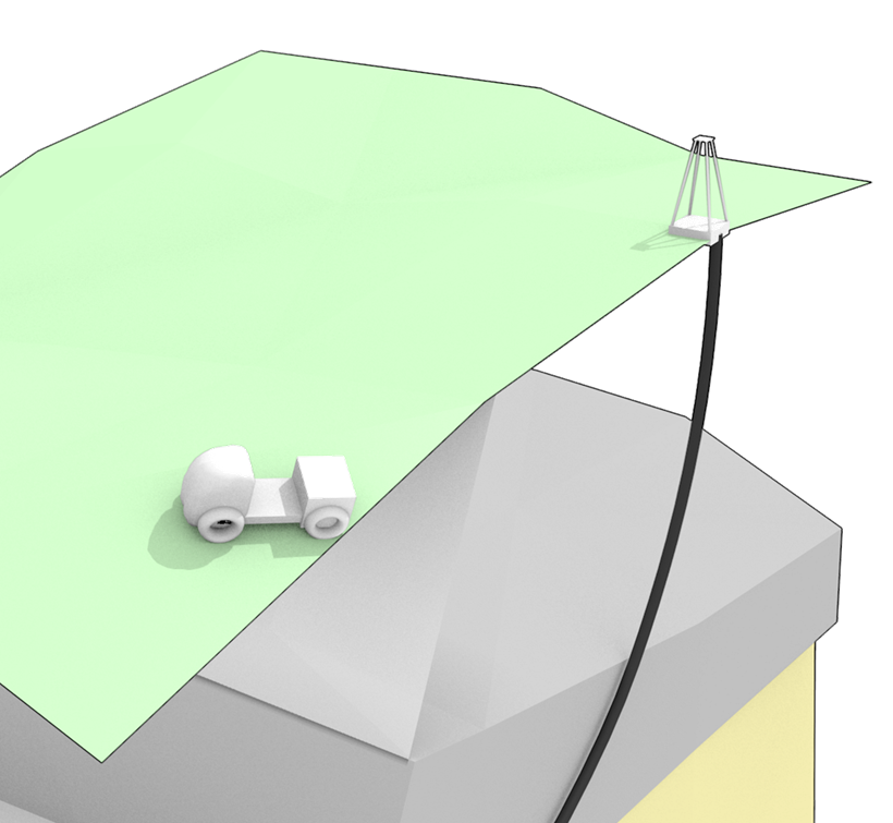
Naturally there is a danger here, reaction to surface appearance in fact has too much influence on how much trust we attach to the message being conveyed. This "halo effect"⌉ has been demonstrated through many experiments. Initially this was noticed when commanding officers were evaluating soldiers, it was demonstrated that the assessment of positive character traits was artificially boosted by the reviewer's perception of the subject's appearance. An aesthetically pleasing presentation has greater impact, that's why advertisers spend so much time and effort enhancing their video slots (and so much money delivering them to us). Previously I've touched on the concept of a "Lie for Children" that Terry Pratchett has explained so amusingly in some of his books. Illustrations are a fantastic instance of this concept, any picture used to illustrate a complex idea must tread a careful tightrope. If it fails to reveal some key aspect or assist understanding at least a little then why would anyone go to the trouble to create it? On the other hand, and more insidiously, a really pleasing picture can have the ability to persuade even when the inspiring concept is seriously flawed. Any representation always simplifies some element, no picture can ever tell the whole story, we should always be aware that every picture misses something out.
⌉ First named and described by Edward Thorndike in his paper "A constant error in psychological ratings" Journal of Applied Psychology 1920
Article 37 |
Articles |
RSS Feed |
Updates |
Intro |
Book Contents |
All Figures |
Refs |
Downloads |
Links |
Purchase |
Contact Us |
Article 39 |